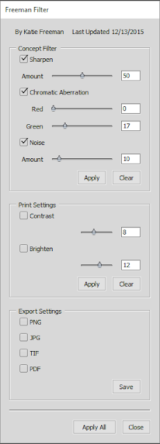
I wanted to make a low profile tool that feels natural and is easy to understand. Below is a screencap of my UI!
So for anyone who hasn't scripted for Photoshop before, let's just say it's not super easy. The documentation basics are available in a PDF form from Adobe (thank you, Adobe!), but a lot of functions in Photoshop are not covered in that, including User Interface. I had never programmed before this semester, so I had to teach myself how to attach my functions to my sliders, attach them to my check boxes, how to orient everything within the UI.. and on top of that, the documentation left a lot to be desired. It was tough to try to figure out how to make a UI in the first place while also having to keep in mind design and usability.
Having overcome these challenges though has made me feel really good! It made me feel accomplished and optimistic when I was finally able to produce something that didn't break horribly.
I coded the tool in JavaScript inside of Adobe's ExtendScript Toolkit CC and designed it to where I can let it grow and evolve as I discover what FIEA's concept artists most need. For the current filters and settings, I got in touch with our professor Nick Zuccarello and an alumni from FIEA, Ryoma Tazi, and asked what they use most commonly in their work.
 So to the left is a screenshot of my tool's UI! As you can see in the value boxes, the default value is set at seemingly random numbers. These are set based off of the research I did from Nick and Ryoma and from trying the tool over and over again on different images.
For each option, the tool is programmed to take all visible layers and make a new, merged layer that the tool is applied to, and that layer is brought to the top of whatever layer folder it is inside of. Then the edited layer is renamed to what the filter is that was applied to it.
The first section is designed mostly for concept art, using filters that many artists apply as a last step on their pieces. Sharpen utilizes Smart Sharpen. Chromatic Aberration mimics a photography effect that most photographers try to avoid but can add a stereo effect to an artwork and give the perception of depth and photo realism. Noise creates a new layer, applies a random fill color, applies noise at 400%, places the layer setting to Overlay, and the slider affects the opacity of that layer.
The second section covers print settings since most printers tend to print dark. Then to accompany the brighten option there's a contrast option. If you check both boxes and apply them both at the same time, their layer is combined and named brighten/contrast. Otherwise it will give them their own named layer!
Then the last section gives save options to give a shortcut to artists who want to just apply the filters then save out their stuff and post to their blog. Selecting any of the boxes then clicking Save will save out that file type to the same location of the original PSD file with the document's original name. If you do it more than once without changing your PSD name, it will overwrite the first file with that extension that it created.
Clicking Apply All does not also apply the Save options to lend more control to the artist. It does, however, apply all of the filters from the first two sections that have checks in their boxes.
So that's the gist of my tool! Below is an example of it in action (a little exaggerated so it shows up better) on one of my older scribbles!
Without tool
With tool applied with exaggerated settings!
I look forward to working more on making tools in the future! It's awesome thinking that I can create something to make other artists' lives a little easier. c:


